From school trip operator to a development-through-travel brand
Together with the ATAS team, we translated 35 years of experience into one system: ATAS Spine. We defined the Creator archetype, built the Dream / Explore / Grow model and delivered an AI-ready brand manual – so the board, marketing, sales and algorithms all speak with one voice.
Key Contributions
Reframed ATAS from “trip organiser” to “development-through-travel environment”.
Built ATAS Spine: mission, promise, differentiators and the Creator archetype supported by Sage and Rebel.
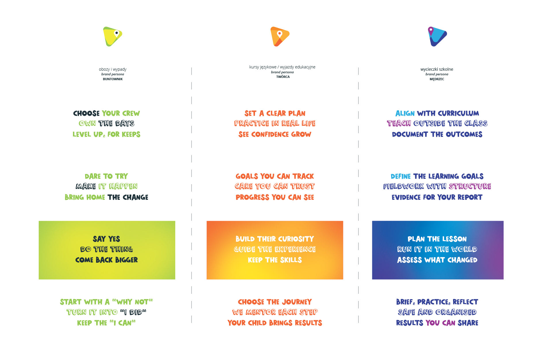
Structured the offer into the Dream / Explore / Grow model and three journeys: for teachers, parents and students.
Designed the new visual identity and key visual based on the Spine triangles.
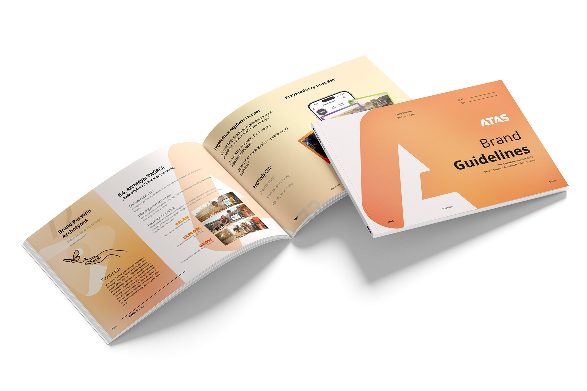
Created an AI-ready brand manual with a “1 core > 3 versions” workflow.
Prepared a 0–90 day implementation plan turning strategy into day-to-day actions.
Three decisions, one brand
ATAS has been on the market for over 35 years. Strong experience, solid procedures, and trust of schools. However, every sale is actually three separate decisions: the teacher’s, the parent’s, and the student’s. Each of them looks at the same trip through a different lens and needs a different kind of story to say “yes”.
When we arrived, the brand was doing many things right, but discussing them in a scattered manner. Most communication was about destinations, dates and prices; far less about how these trips actually shape young people. Our job, together with the client, was to identify this potential, organise it, and turn it into a system that can be implemented in communication, in the offer, and in the way ATAS works with AI.
One Spine instead of 3 competing stories
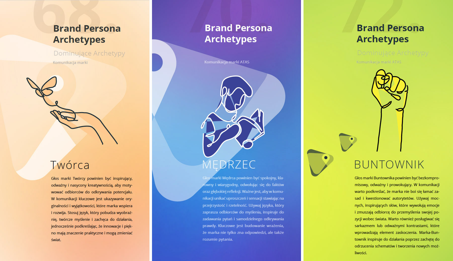
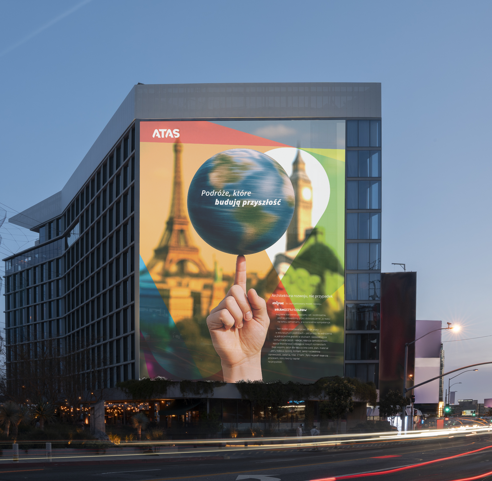
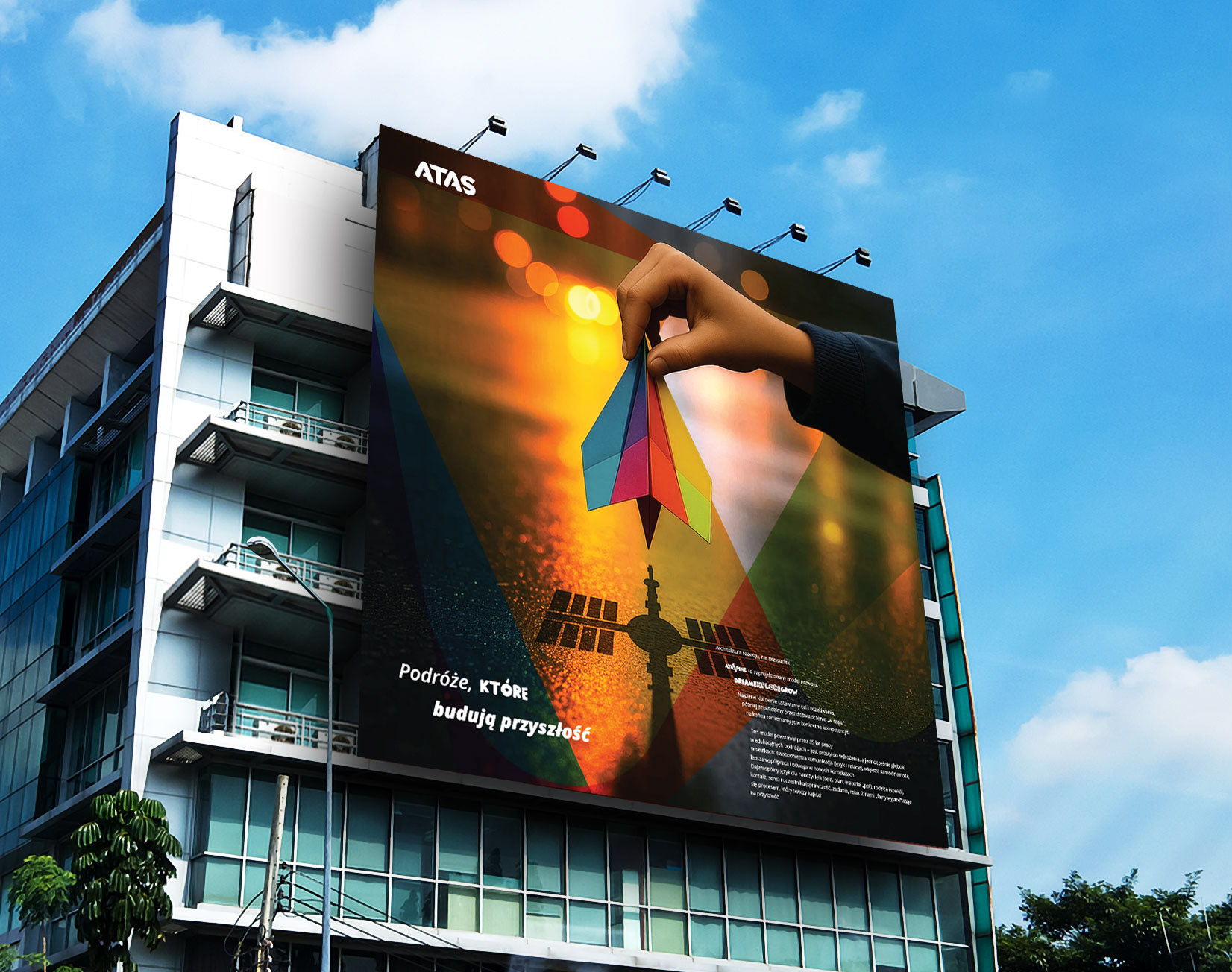
We started with joint workshops for the board, marketing and sales. Based on those sessions, a communication audit and the team’s experience, we built ATAS Spine – the brand’s backbone. This is where we defined the mission, the promise “travel that builds futures”, the key differentiators and values that can be seen in real behaviours, not only in slideware.
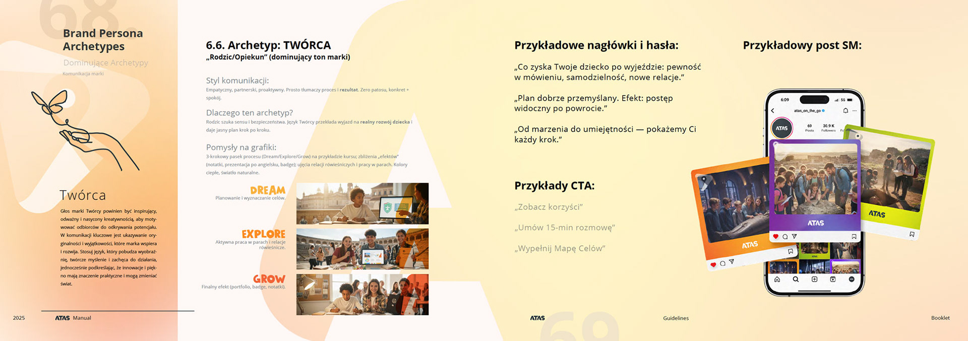
On the archetype level, we positioned ATAS as a Creator – a brand that designs development experiences, not just “organises a trip”. We strengthened this with Sage (for teachers) and Rebel (for students), so the communication can stay consistent and still feel tailored. The Spine became a reference point for the board, a brief for marketing, a shared language for sales and the base layer for AI.
Dream / Explore / Grow – a process, not a list of attractions
The next step was restructuring the offer. Together with the client we moved from “a trip to…” thinking into a Dream / Explore / Grow process. Before the trip we build the dream and the rationale (Dream), during the trip we deliver designed experiences and tasks (Explore), after the trip we show the outcome and the next step (Grow).
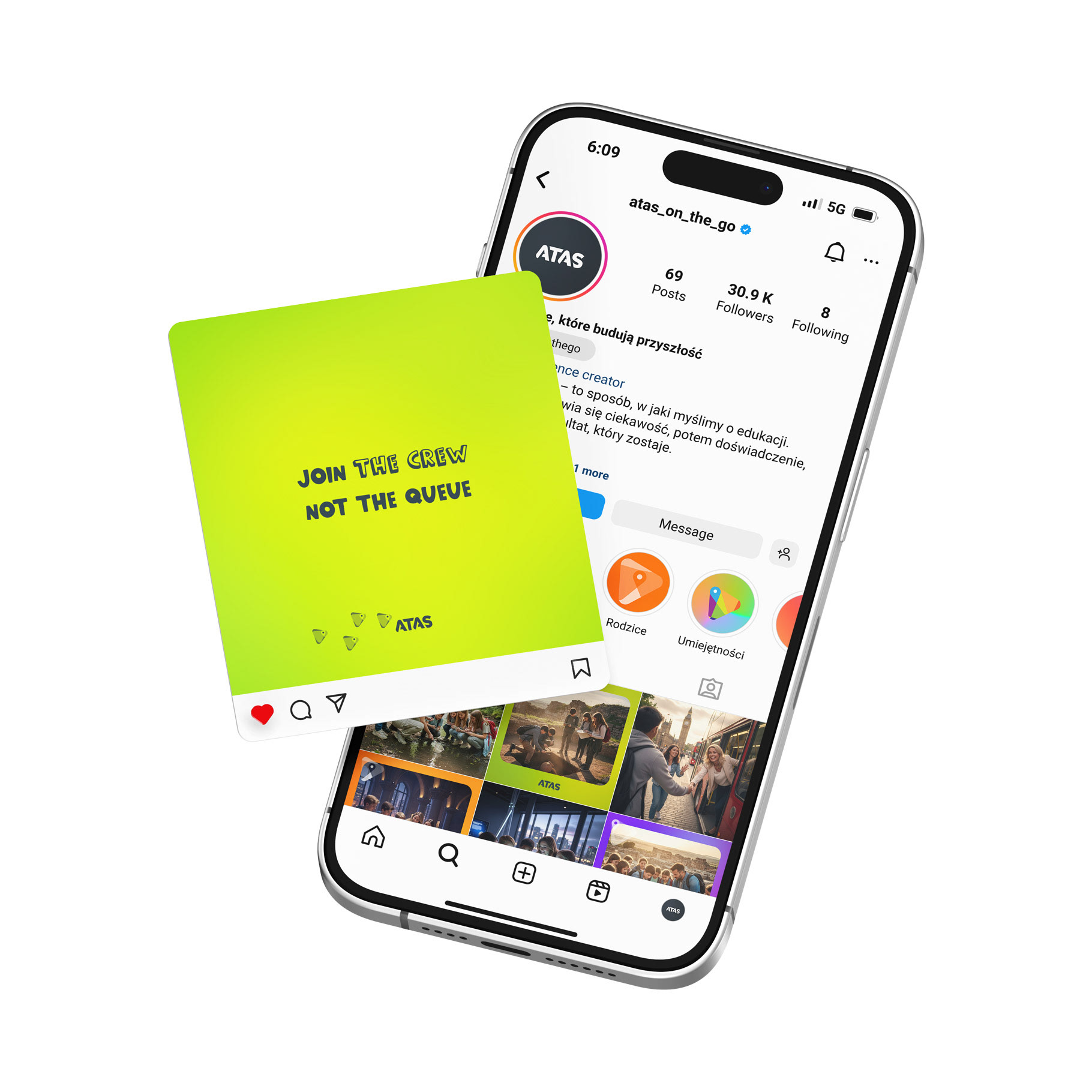
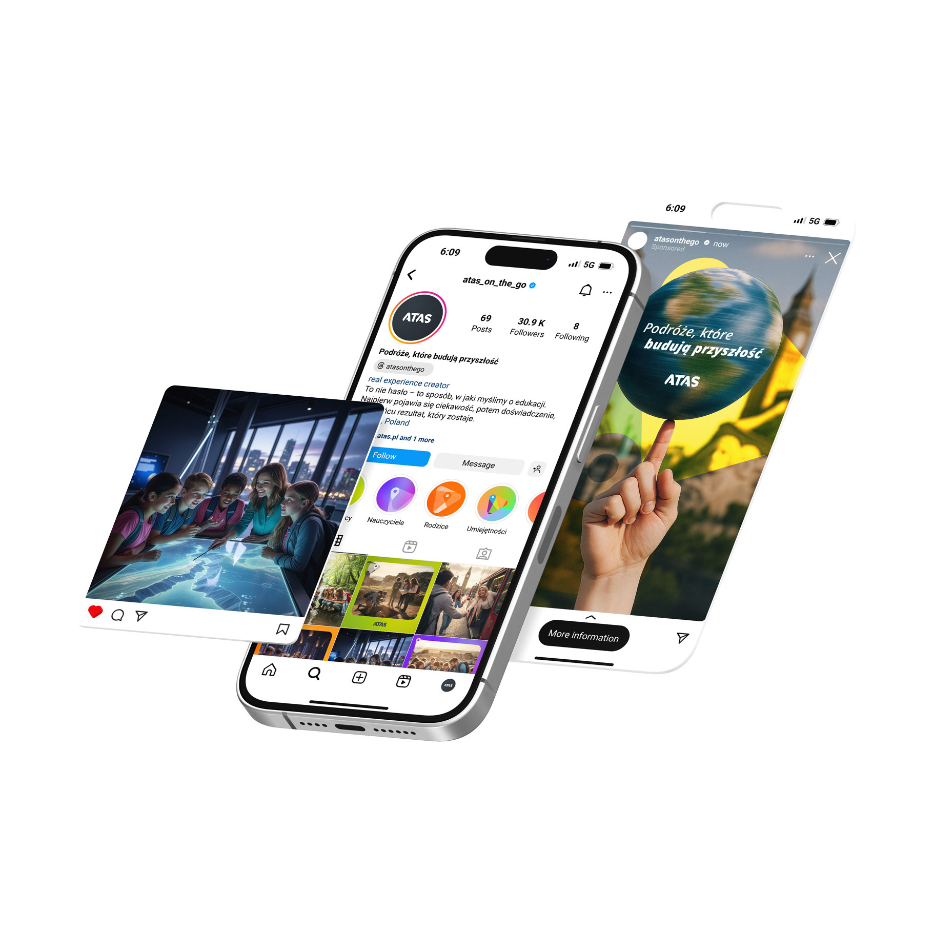
We mapped this model onto three separate journeys: teacher, parent and student. Each got a dedicated path, tone of voice, key questions and clear answers. On this foundation, we created the Teacher Pack, Parent Guide and Student Kit. As a result, one ATAS trip is no longer just logistics. It’s a designed development process, told in the language each decision-maker needs.
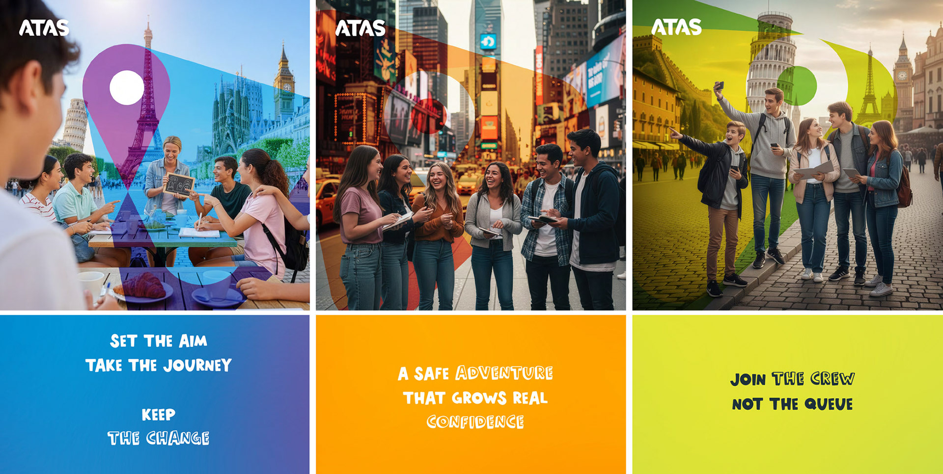
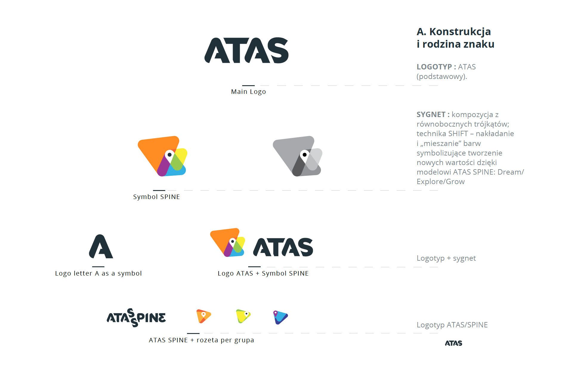
New identity – a mark that carries the idea
Strategy needed a form. We designed the new ATAS logo based on overlapping triangles – a visual shorthand for the Spine and the Dream / Explore / Grow triptych. We added a colour palette mapped to the three stages, spatial key visuals and typography that works equally well for serious conversations with teachers and energetic youth-focused formats.
Everything is documented in the manual so in-house teams, agencies and partners can safely build new campaigns, materials and formats without pulling the brand apart. We turned it into a system, not just a “nice logo refresh”.
AI-ready manual: a brand that can brief algorithms
From day one, we designed the manual as a working tool, not a commemorative PDF. Every key strategic decision was translated into a prompt matrix and a simple “1 core > 3 versions” workflow. First, we write the core message based on ATAS Spine, then we branch it out: teacher version, parent version, student version.
The ATAS team received ready-to-use prompt frameworks for website content, social media, newsletters, ads and sales scripts. On top of that, we built a quality checklist that helps verify whether AI-generated copy stays on-brand and aligned with the archetype and promise. AI becomes an extension of the team, not a source of noise.
ATAS as a creator of development experiences
Together with the client we moved ATAS from “school trip operator” to a brand that consciously designs youth development through travel. Today ATAS has a single strategic backbone, three well-defined communication journeys, a new identity and a manual that actually guides the team through implementation – including AI.
This approach gives ATAS room to grow: faster campaign design, clearer messaging for teachers, parents and students, and a brand that is built for the way communication and technology really work now, not five years ago.
All of this means that ATAS moves from being “just a trip organiser” to becoming a creator of development experiences – one that can speak the same consistent language to teachers, parents, students and… algorithms.
Strategy & creative: Cezary Ziemiński
Social Media Advisor: Angelina Kurban
Client team lead: Iza Szczepańska
Social Media Advisor: Angelina Kurban
Client team lead: Iza Szczepańska